
Written by: Senior AQA Engineer
Ievgen IevdokymovPosted: 26.05.2026
31 min read
"Seamless." Every fintech product brief contains the word. Every investor pitch promises it. And somewhere in roughly 70% of financial institutions, a frustrated user is right now abandoning a KYC flow, staring at a generic error message, or wondering whether their £2,400 transfer actually went through.
The gap between the word 'seamless' and the reality of a financial app's UX isn't a design failure. It's a testing failure. Somewhere between the Figma prototype that looked great and the production app that real users navigate under real anxiety, someone didn't define what seamless actually means in a way that a test could verify.
That's what this article is about. Not UX design best practices, there are plenty of those. This is for QA leads and CTOs who want to test whether their fintech product's UX is good enough, and who need a framework for turning 'seamless experience' from a marketing promise into a pass/fail criterion.
The cost of getting this wrong
73% of users say they would switch banks for a better digital experience. 68% abandon a transaction if they encounter usability issues. 88% never return after a bad experience. And according to a 2025 Fenergo survey of 600 senior executives, 70% of financial institutions lost clients last year due to inefficient onboarding, up from 48% in 2023. This isn't a UX design problem. It's a QA problem that design is being blamed for.
The problem with "seamless". Why it's the most abused word in fintech
Here's an exercise. Take your last product brief, find every use of the word 'seamless,' and ask: what does the test case for that look like? What's the acceptance criterion? What user behavior, on what task, at what completion rate, constitutes 'seamless onboarding'?
If you can't answer that, your QA program has a gap, and it's not a small one.
Fintech UX is six high-risk flows for three reasons that directly affect how you test it:
The emotional stakes are real. Users managing money experience anxiety, fear of irreversible mistakes, and loss aversion in ways that don't activate when they're booking a table or streaming a playlist. A confusing interface in a food delivery app is annoying. A confusing interface during a £3,000 international transfer is distressing.
Regulatory constraints create mandatory UX requirements. KYC flow design isn't optional. Disclosure timing isn't aesthetic. Consent language isn't copywriting. These are legal obligations, and how they're implemented is a UX testing problem as much as a compliance one.
The cost of UX failure is measurably higher. Signicat estimates that onboarding abandonment in European fintech alone wastes approximately €5.7 billion annually in acquisition spend. That's not users who had a mildly frustrating experience. That's completed acquisition spend that converted into nothing because the onboarding UX wasn't tested properly.
UI bugs cost users. We help you keep them.
What 'Seamless' must mean as a testable criterion
If you're going to test for seamlessness, you need an operational definition. Here's one that actually works in practice:
Task completion without external assistance: The user can complete the target action, send a payment, complete KYC, apply for a loan, without contacting support, searching for documentation, or requiring a second attempt.
Error recovery without data loss: When something goes wrong, users can recover to a successful outcome without losing progress, re-entering data, or starting over.
Emotional state preservation through friction: Users who encounter a mandatory compliance step, security verification, or processing delay understand what's happening and what to do next, without anxiety escalating to abandonment.
Cognitive load at or below context-appropriate ceiling: The mental effort required to complete the task is proportionate to the task's significance, daily balance checking should require near-zero effort; a first-time investment decision will legitimately require some.
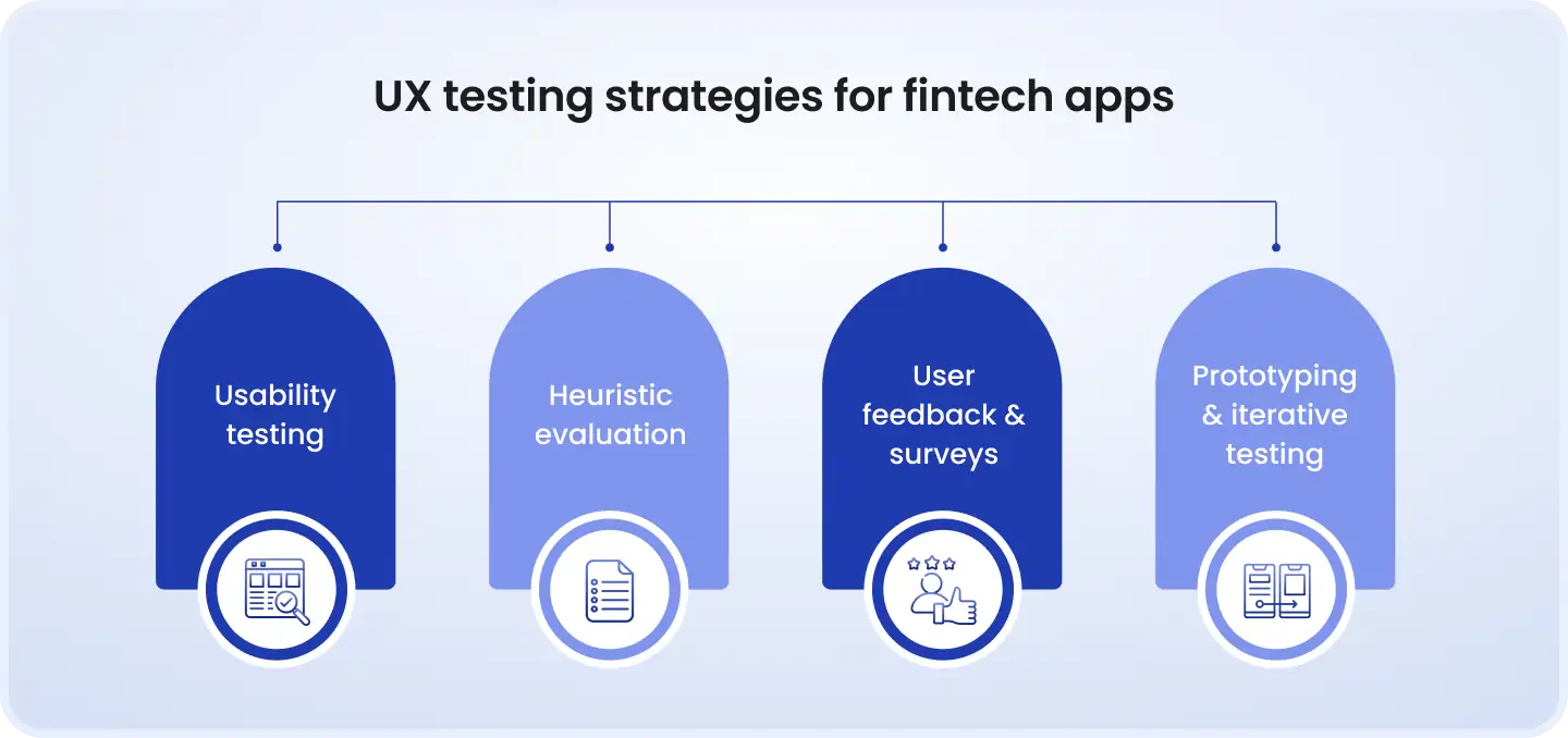
These four properties are testable. Each of them maps to observable user behaviors, measurable metrics, and pass/fail criteria. We'll build those out for each major fintech flow.
Where fintech UX actually breaks. The six high-risk flows
Most fintech testing programs test the happy path. The user opens the app. They navigate correctly. They complete the action. Done. What they don't test is what happens in all the ways the experience goes wrong, and in financial services, those are the moments that determine whether a user stays or leaves.
Flow 1. Onboarding and KYC
Onboarding is where fintech platforms spend the most on acquisition and lose the most from abandonment. Titan Financial's onboarding completion rate jumped from 31% to 78% after a single UX redesign, not a new product, not a new technology, just testing and fixing what was broken.
The UX failures in KYC specifically cluster around five testable moments:
Opaque requirements: The user doesn't know what documents are acceptable until they've already failed an upload attempt. Test: complete the KYC flow with valid but 'wrong-format' documents and measure the clarity of the rejection message.
No progress indication: Multi-step verification processes without clear progress indication cause disproportionate abandonment. A user who doesn't know they're on Step 2 of 5 vs. Step 2 of 12 will make different decisions about whether to continue.
No save-and-resume: A user who reaches Step 4 of 7 and gets interrupted must restart from zero. Test explicitly: interrupt a KYC session at each step and verify what state is preserved.
Regional friction mismatch: KYC requirements vary significantly by jurisdiction. In the UK, onboarding may legitimately take 5+ minutes. In some markets, sub-20-second completion is the norm. A UX designed for one market creates abandonment in others.
Opaque rejection: When a document is rejected, users need to know specifically what went wrong, wrong document type, quality issue, partially obscured information, not 'verification failed, please try again.'
The onboarding abandonment numbers
According to Finextra, 60% of users abandon onboarding due to friction in the process. Deloitte's 2025 research found that 38% of new customers leave mid-onboarding if the process takes too long. AI-assisted verification can reduce onboarding time by 30–50% compared to legacy manual checks. The UX testing implication: you need to know your current completion rate by step, and you need to define a minimum acceptable rate for each step before you can test against it.
Flow 2. Payment initiation and confirmation
The payment flow is the highest-anxiety moment in any financial app. The user is committing to an irreversible action with real financial consequence. The UX testing failures here are often subtle and extremely costly:
Input formatting friction: Entering an IBAN, sort code, or account number without formatting assistance is needlessly stressful. Test: give a real user an account number to enter, observe their error rate, and measure time-on-task. Most teams are surprised by what they find.
Ambiguous processing state: The user hits submit. Nothing happens for 3 seconds. Is it processing? Did it fail? Did it submit twice? This moment, the silence between intent and confirmation, is where users panic, hit submit again, and create duplicate payments. Test: introduce artificial latency and observe user behavior.
Generic decline messages: 'Payment failed. Please try again.' This tells the user nothing. Was it declined by their bank? Did your system time out? Was there a fraud flag? Did the recipient's account information change? Each of these has a different resolution path, and a generic error puts all the cognitive burden on the user to figure out which one.
Insufficient confirmation UX: After a large payment, does the confirmation screen communicate finality with appropriate weight? 'Sent!' with a green checkmark on a £15,000 wire transfer may not be sufficient to prevent a support call from an anxious user wondering if it really worked.
Flow 3. Error states and recovery
Error messages are the most tested and worst-written UI copy in fintech. Every company has a QA test that verifies the error appears. Almost no company has a QA test that verifies the user can recover from the error.
The distinction matters enormously. An error that appears correctly and is completely useless is a passing test result that represents a failed user experience.
Information content: Does the error message tell the user what went wrong? Does it tell them what to do next? Does it preserve what they've already entered?
Tone calibration: A technical error during a routine balance check warrants a different tone than an error during a large transfer or loan application submission. Test that your error states are calibrated to the emotional context of the flow they appear in.
Recovery completion rate: The actual test: inject a specific error into a specific flow, give the user no additional information beyond what the UI provides, and measure what percentage of users successfully recover to task completion. This number will be lower than your UX team expects.
Flow 4. Financial dashboard and data comprehension
48% of consumers log into their mobile banking apps or websites daily (Q2 Holdings 2024). The dashboard is the most-repeated touchpoint in any banking product, and it's also the most data-dense, most cognitively loaded interface in the application.
The specific UX testing failures in dashboard design:
Balance ambiguity: Available balance, current balance, pending transactions, held amounts, users who don't understand the difference between these numbers make incorrect financial decisions. Test: ask users, without guidance, to identify the amount they can spend right now. Measure accuracy.
Transaction history comprehension at scale: A user with 200 transactions in a month needs to find a specific transaction quickly. Test time-to-locate against realistic data volumes, not a 5-transaction demo environment.
Data density ceiling: Investment dashboards, multi-account views, and analytics screens can hit a cognitive load ceiling where the density of information makes the dashboard less useful than a blank screen. Test with real users making real decisions, not internal testers who are comfortable with the data model.
Flow 5. High-stakes financial decisions
Loan applications, investment commitments, insurance purchases, pension transfers, these flows carry legally required disclosures that add cognitive load at exactly the moment it should be lowest. The UX testing challenge is simultaneously verifying compliance and verifying usability.
This is where most testing programs fail: they verify the disclosure exists and is complete. They don't verify the user comprehended it.
Comprehension testing: After a user has read and 'accepted' a loan agreement, ask them to state the APR and the total repayment amount. The accuracy rate among real users is typically significantly lower than product teams assume. This is a UX failure AND a potential mis-selling exposure.
Irreversibility signaling: Users should understand, before they commit to an irreversible action, that it is irreversible. Test: what percentage of users understand that a pension fund switch cannot be reversed within 24 hours? That a forex transaction executed at market rate cannot be cancelled? If they don't know, your confirmation screen isn't doing its job.
Flow 6. Cross-channel continuity and session recovery
A user starts a mortgage application on desktop at work, continues on mobile during commute, gets an OTP request that interrupts the flow, returns three hours later on a different device. Does the experience hold?
Most fintech products have tested individual channel experiences. Most have not tested the handoffs between them, and those handoffs are precisely where user data, progress, and context drop out.
Save-and-resume: Test explicitly, at every step of every multi-stage flow, that partial progress is preserved across device changes, session expiry, and app restarts.
Notification UX: A payment reminder should reduce user anxiety, not create it. A security alert should inform, not panic. Test how users emotionally receive specific notification types, and whether the action they take after receiving the notification is the intended one.
Defining UX test criteria. Turning 'seamless' into pass/fail
Every UX property can be made testable. The reason fintech teams struggle with UX testing isn't that UX is subjective, it's that they haven't done the work of defining what an acceptable result looks like before they run the test. Here's how to do that for each major flow category.
The fintech UX testing hierarchy
UX quality in fintech has four layers. Most testing programs cover Layer 1. Almost none reach Layer 4. Yet Layers 3 and 4 are where the conversion data, the NPS data, and the churn data actually live.
1
Functional UX (does it work?)
Buttons respond, forms submit, navigation works
Yes, almost always
2
Cognitive UX (can users understand it?)
Users know what to do and understand what happened
Partially, happy path only
3
Emotional UX (do users feel safe?)
Users feel confident and in control during financial actions
Rarely
4
Trust UX (does it build long-term confidence?)
Cumulative experience builds platform credibility
Almost never
KPIs that make 'seamless' measurable
The following metrics define pass/fail for UX quality in specific fintech flows. These aren't industry standards, your specific baselines will depend on your product, user segment, and market. But these are the right metrics to track.
KYC onboarding
First-attempt completion rate
Time-to-completion vs. benchmark
< 65% complete without support contact
Payment initiation
User-induced input error rate
Confirmation read time
> 5% error rate on payment entry fields
Error recovery
Recovery completion rate
Time-to-recovery from error state
< 80% successful recovery without abandonment
Dashboard
Target-finding time (key data point)
Unaided navigation success rate
> 8 seconds to locate primary balance
High-stakes decision
Comprehension accuracy post-disclosure
Drop-off rate at disclosure step
< 60% accurate recall of key committed terms
Cross-channel flow
Resume success rate after interruption
Data preservation rate across sessions
Any progress loss > 0% at session resume
Writing testable UX acceptance criteria for fintech
The structural format for a UX acceptance criterion in fintech:
Given [user context and prior state] + When [trigger action or event] + Then [observable, measurable UX outcome].
Examples from real fintech flows:
KYC document rejection: "Given a first-time user uploading an identity document, when the document is rejected for image quality, then the rejection message must specify the quality issue, and 80% of users must successfully recover to a completed document upload within the same session without support contact."
Large payment confirmation: "Given a user initiating a transfer above £1,000, when the user reaches the confirmation screen, then 90% of users must correctly identify the recipient account and transfer amount before proceeding, as measured by a think-aloud session or comprehension check."
Error during payment: "Given a card decline at payment, when the error state is displayed, then 85% of users must correctly identify the next available action within 15 seconds, without additional guidance from the testing facilitator."
Processing state: "Given a payment submission that takes > 3 seconds to confirm, when the user is in the processing state, then 0% of users should submit the payment a second time, as measured by duplicate submission rate in session recordings."
Emotional UX testing. The dimension every fintech QA process skips
This is the section that makes most QA leads uncomfortable, because 'emotional UX' sounds like something that belongs in a psychology paper, not a test plan. But here's the practical reality:
Users make split-second judgments about a financial platform's competence and trustworthiness in less than 50 milliseconds, before they've read a word of content. Those judgments determine whether they complete a transaction or abandon the app, whether they recommend the product to a colleague or warn them away from it, and whether they trust the platform with progressively larger financial actions over time.
That's not subjective. It's measurable, testable, and directly connected to your revenue and retention numbers.
How to identify emotional UX failure points
The practical approach: map your user journey and identify every moment where a reasonable user in your target demographic would experience elevated anxiety. These are your emotional UX test points.
In fintech, these moments cluster around:
High-value irreversible actions: Large transfers, investment commitments, loan acceptances. The UX must communicate weight without inducing panic.
Authentication friction at high-stakes moments: Being asked for additional verification mid-transaction feels threatening rather than reassuring if it's not clearly framed. 'We just need one more step to protect this transaction' is a UX statement, not a security one.
Waiting states: Financial transactions that take longer than a few seconds to confirm generate anxiety proportional to the amount at stake. An unadorned spinner on a £10,000 wire transfer is an emotional UX failure, even if the transfer succeeds.
Compliance disclosure moments: The legally required wall of text before a financial commitment is a known UX failure point. The test isn't whether the disclosure is present, it's whether the user feels informed or overwhelmed after reading it.
Practical methods for testing emotional UX in financial products
Self-reported confidence scales
During payment initiation and confirmation, add a simple confidence prompt after each significant step: 'On a scale of 1–5, how confident are you that what you just did was correct?' Track this across the flow. Any step where average confidence drops below 3 is an emotional UX failure point, even if the functional test passed.
Behavioral anxiety signals in session recordings
Session recordings and analytics contain observable proxies for user anxiety that require no self-reporting:
Hesitation before submission: Extended time on a confirmation screen before clicking 'submit', beyond what reading requires, signals doubt.
Multi-read patterns: Scrolling back to re-read content that should have been clear on first read signals cognitive overload or insufficient clarity.
Back-navigation without progress: The user navigates back from a step, then forward again, without entering new information. This is a decision-making paralysis signal.
Rage-click patterns: Repeated clicking on an element that isn't responding, or isn't interactive, signals interface confusion. Any rage-click in a payment flow is a P1 UX incident.
Error message quality testing. The read-aloud method
Take your error messages. Print them out. Read them to someone who has never seen your product. Ask them: what do you think went wrong? What do you think you should do next?
If they can't answer those questions accurately, the error message failed, regardless of whether it appears correctly in your test suite. This is the simplest and most effective UX test you're probably not running. It takes 20 minutes per flow and costs nothing.
Compliance UX testing. Where regulation creates test cases
Most fintech teams treat compliance as a constraint on UX design. It is also, and this framing is vastly underused, a source of testable UX requirements. Regulatory obligations define specific outcomes that UX must deliver, and those outcomes are directly testable.
Translating regulatory requirements into UX test scenarios
GDPR consent flows: Regulatory requirement: consent must be freely given, specific, informed, and unambiguous. UX test: can users accurately describe what they're consenting to after reading the consent screen? Is the 'refuse consent' option equally prominent as 'grant consent'? Is the language specific enough that users understand the difference between consenting to product improvements data and consenting to marketing communications? These are not legal questions, they're UX testing questions.
PSD2 Strong Customer Authentication: Regulatory requirement: step-up authentication for transactions above defined thresholds. UX test: measure the completion rate of SCA challenges. A 12% drop in SCA completion isn't just a conversion problem, it's a UX failure that translates directly to unprocessed transactions and lost revenue. Test SCA challenge completion rate by challenge type (SMS OTP vs. biometric vs. in-app approval) and optimize accordingly.
FCA Consumer Duty: Regulatory requirement: consumers must achieve good outcomes when using your product. UX test: demonstrate that customers can successfully complete intended financial actions at an acceptable rate. This is a regulatory test case that requires exactly the same kind of moderated usability testing you'd run for UX optimization, the difference is that a poor result now carries regulatory rather than just commercial consequences.
CFPB BNPL disclosure requirements: Regulatory requirement: clear disclosure of repayment terms, dispute rights, and refund processes. UX test: comprehension testing of mandatory disclosures, not 'is the text there?' but 'do users understand it?' The CFPB specifically expects evidence of real-world usability, not just checklist conformance.
The 'compliant but unusable' failure pattern
This is the most common compliance-UX failure in fintech: an interface that meets every letter of the regulatory requirement while delivering a user experience that causes the very harms the regulation was designed to prevent.
The clearest example: a risk disclosure for an investment product that is legally complete, fully reviewed by compliance, and technically present in the user flow, but positioned, formatted, and sized such that no real user reads it. The user proceeds, takes on more risk than they intended, and has a poor outcome. The product is compliant. The user was harmed. The UX test failed before it was ever run.
The test you need: After a user has completed a regulated disclosure step, ask them specific comprehension questions about the disclosed information. Define a minimum accuracy threshold. If less than 75% of users can correctly state the key terms of what they just agreed to, your disclosure UX has failed, regardless of what the compliance audit says.
The regulatory UX risk in numbers
Fenergo's 2024 AML fines analysis found that global regulatory penalties reached $4.6 billion in 2024, with North America accounting for 94% of that total. Many of these enforcement actions have UX components: misleading interface design, hidden fee disclosures, consent flows that don't demonstrate genuine informed consent. The overlap between 'bad UX' and 'regulatory breach' is not theoretical, it's documented in enforcement actions.
UX testing methods. Matching method to fintech flow
Not every UX testing method works for every fintech flow. The wrong method produces misleading results, and in a regulated, high-stakes environment, misleading results are worse than no results at all.
Moderated usability testing. When it's non-negotiable
Moderated testing (a facilitator observes a user completing tasks in real-time) is the only method that can reliably surface the emotional UX dimension. It's also the only method that works for flows where users can get genuinely stuck and need to be brought back into the session.
Required for fintech specifically:
First-time KYC onboarding: The anxiety and confusion of identity verification cannot be replicated in unmoderated testing where users self-select their pace and experience no consequences for stopping.
High-stakes financial decisions: Loan applications, investment commitments, pension changes. The risk of an unmoderated test is that users proceed without the anxiety a real user would experience, leading you to underestimate drop-off and confusion rates.
Error recovery flows: You need to inject specific error states and observe how users respond with no additional guidance. This cannot be done unmoderated without unacceptable external validity concerns.
Practical note on KYC testing in moderated sessions: use synthetic identity personas and sandboxed verification environments with pre-configured outcomes (approve, reject for quality, reject for document type) so you can test specific branches without using real user data.
Unmoderated testing. Where it works and where it misleads
Unmoderated testing (users complete tasks independently, session is recorded) works well for fintech flows that are:
High-frequency and low-stakes: daily balance checking, transaction history browsing, card management
Navigation and information architecture: can users find a specific setting? Is the navigation structure logical?
Visual comprehension: is the data hierarchy of the dashboard clear at first glance?
Where unmoderated testing misleads in fintech: any flow involving significant financial commitment, anxiety-inducing stakes, or mandatory compliance steps. Users in unmoderated sessions don't replicate the emotional state of a real transaction because there are no real consequences. An unmoderated test of a loan application UX will consistently overstate completion rate and understate confusion, because the test participant knows it doesn't matter if they get it wrong.
A/B testing in fintech. The compliance constraints
A/B testing is a powerful UX optimization tool in fintech, with hard constraints that most teams discover too late:
You cannot A/B test two versions of a mandatory disclosure: One version may change the legal interpretation of the consent given. Run disclosure variations past your compliance team before A/B testing.
You cannot A/B test different consent flow designs: If Variant B makes consent marginally easier to grant but less clearly explained, you may be improving conversion at the expense of genuine informed consent, which is both a UX failure and a regulatory one.
What you can A/B test effectively in fintech:
Visual hierarchy and layout of information that doesn't change the information itself
Error message copy that explains the same underlying error in different language
Button placement, form field order, progress indicator design
Confirmation screen design and specificity of transaction summary
Real example of what works: Bitcoin of America reduced sign-up form fields from 14 to just 2 while fully adhering to regulatory requirements and achieved a 67% increase in account conversions and a 12% drop in bounce rates. That's an A/B test that ran within the compliance envelope and produced a measurable business outcome. The lesson isn't 'reduce all form fields', it's 'identify which fields are regulatory requirements and which are assumptions about what you need.'
Session analytics as continuous UX signal
Behavioral analytics tools (FullStory, Hotjar, Mixpanel) give QA teams a continuous signal on UX health without requiring scheduled testing cycles. The specific patterns to monitor in fintech:
Funnel drop-off by step: Where in a multi-step flow are users abandoning? Even a 1% improvement in KYC step 3 completion can represent meaningful conversion impact at scale.
Rage-click analysis: Any rage-click pattern in a transaction or verification flow is a high-priority UX incident. Log them, investigate them, fix them.
Back-navigation patterns: Users navigating backward through a flow, particularly from commitment steps, indicate confusion or insufficient information at that step.
Session replay of abandonment: Watching the last 30 seconds of an abandoned session reveals what specifically triggered the abandonment more accurately than any survey.
Privacy note: Session analytics in fintech require careful scoping to avoid capturing sensitive financial data. Configure your analytics tools to exclude account numbers, balances, personal information, and transaction details from capture. Record behavioral patterns (clicks, scrolls, navigation) but not the financial content those behaviors were directed at.
Automation vs. manual in fintech UX testing
The automation vs. manual question in UX testing is different from the same question in functional or security testing. UX quality cannot be fully automated, but significant portions of the scaffolding can and should be.
Visual regression (layout, component consistency)
Automate
Percy, Chromatic, Applitools, run on every release; catch unintended UI changes that degrade UX
Automate baseline
axe-core in CI/CD; catches 30–40% of issues; essential but not sufficient
Performance perception (page load, confirmation latency)
Lighthouse CI, Datadog RUM, monitor against UX-defined latency thresholds, not just technical uptime
A/B test statistical significance
Automate decision
Optimizely, LaunchDarkly, remove human judgment from significance calls
Funnel drop-off rate monitoring
Automate monitoring + trigger
Mixpanel, Amplitude, automated alerts when drop-off rate exceeds defined threshold for any step
First-use onboarding experience
Manual, always
Requires real first-time users with no product familiarity; cannot be replicated internally or with repeat sessions
Error recovery flow testing
Manual, always
Requires observing real user response to unexpected states; automated tests verify error appears, not that user can recover
Disclosure comprehension testing
Manual, always
Cannot be automated; requires human comprehension assessment; also has regulatory compliance value
Emotional state at high-stakes moments
Manual, always
Self-reported confidence scales, behavioral observation; no automated proxy is reliable
Cross-device session continuity
Automate partial + manual confirm
Automate data preservation checks; manual testing for actual user experience of the handoff
The UX regression problem. How 'seamless' erodes after release
UX regression is a QA category that most fintech teams don't formally track. A bug regression is a feature that worked and broke. A UX regression is a feature that felt intuitive and became clunky, usually because surrounding changes created new friction, user expectations evolved, or a small 'simplification' removed context that users relied on.
The Bitcoin of America result (67% conversion improvement from reducing form fields) is also a story about UX regression: at some point, 12 unnecessary form fields were added to a flow that originally had 2. Each addition probably seemed justified in isolation. No one tracked the cumulative UX cost.
Signals that should trigger a UX reassessment:
Step abandonment rate increases > 5% quarter-over-quarter without a product change at that step, indicates surrounding changes are creating friction in the flow
Support ticket volume for a specific flow increases, particularly tickets that describe user confusion rather than technical errors
NPS drops with explicit feedback referencing a specific flow or feature
Competitor publishes a materially better UX for a comparable flow, raising user expectations without any product change on your side
Building your fintech UX testing program
If your current QA program doesn't include formal UX testing beyond basic accessibility and visual regression checks, here's how to build one without stopping your release cycle to do it.
Phase 1. Establish your baseline (weeks 1–3)
Before you can improve UX quality, you need to know where you currently stand. Run a lightweight baseline across your three highest-priority flows:
Funnel analysis: Pull drop-off rates at every step of your KYC, payment, and primary feature flows. Identify the three steps with the highest abandonment. These are your immediate test priorities.
Session recording review: Review 20 abandoned sessions for each high-priority flow. Categorize abandonment by trigger: rage-click, back-navigation, timeout, hesitation. You'll see patterns immediately.
Error message audit: List every error message in your primary flows. Apply the read-aloud test: do they tell users what went wrong and what to do next? Flag every message that fails.
Phase 2. Define your acceptance criteria (weeks 3–5)
Using the KPI framework from the earlier table, define minimum acceptable thresholds for each flow:
First-attempt completion rate for onboarding
Error recovery completion rate for the three most common error states
Comprehension accuracy for the highest-stakes disclosure in your product
Duplicate submission rate for payment and investment flows
These numbers become your UX pass/fail criteria, the same way performance testing has SLO thresholds, UX testing now has completion rate and comprehension rate thresholds.
Phase 3. Run the first moderated sessions (month 2)
Schedule moderated usability sessions for your three highest-risk flows. Use participants from your actual target demographic, not developers, not product managers, not QA engineers who know the product. Measure against the acceptance criteria you've defined. Every session where a user fails to meet the threshold is a failing test result, the same as a red test run.
Phase 4. Integrate into the release cycle (month 3+)
UX testing that happens quarterly as a separate exercise doesn't protect releases. UX regression detection needs to be continuous:
Automated: Funnel drop-off monitoring with alerting, visual regression on every release, performance perception monitoring
Per-sprint: Error message review for any new error states introduced, comprehension check for any new disclosure or legal content added
Per-quarter: Full moderated session cycle for any flow that has been significantly changed, or any flow where automated signals show regression
Need a UX testing baseline for your fintech product?
DeviQA's QA team specializes in fintech-specific UX testing, from KYC flow usability assessment to payment confirmation comprehension testing and compliance-UX gap analysis. We run moderated sessions with real users from your target demographic and deliver actionable results mapped to your specific acceptance criteria. Talk to our team about establishing your UX testing baseline.
Book a strategic QA consultation
The most common fintech UX testing mistakes
These aren't theoretical antipatterns. They're the patterns we see consistently when we audit UX testing programs at fintech companies.
Testing with internal users who know the product: The 'expert user' problem. Your QA engineer knows that the KYC document upload accepts JPGs but not PDFs. Your real user doesn't. Any test run by someone who already knows the correct path is measuring something other than UX quality.
Testing the happy path exclusively: A user who enters all information correctly, never encounters an error, and completes every step as designed is not a representative user. They're a best-case scenario. Your UX testing program must include error injection, interruption scenarios, and confusion-state testing as standard procedure, not edge cases.
Treating compliance review and UX testing as separate processes: The loan application comprehension failure is a story about compliance and UX being tested in isolation. The disclosure was compliance-reviewed for completeness. It was never UX-tested for comprehension. The result was both a UX failure and a regulatory risk. These reviews need to happen together.
Measuring task completion without measuring emotional state at completion: A user who completes a loan application in a state of confusion and anxiety is not a successful test outcome. They're a churned customer and a mis-selling exposure waiting to happen. Completion rate tells you what users did. Confidence scores tell you whether they understood it. You need both.
Running UX tests on wireframes and never retesting on production: Wireframe testing is valuable. It is not sufficient. The visual design, the actual copy, the real loading times, and the production data environment all create UX experiences that wireframes don't replicate. Every significant UX test on a wireframe should generate a corresponding test on the production equivalent.
Not defining failure thresholds before testing: A usability session that produces observations without predefined pass/fail criteria is qualitative research, not quality assurance. It informs design decisions. It doesn't tell you whether your product is good enough to release.
Forrester Research's oft-cited figure, every $1 invested in UX brings $100 in return (9,900% ROI), is applicable to fintech specifically because of the compounding value of trust. A user who has a seamless first transaction doesn't just complete that transaction. They're statistically more likely to make the next one, refer a colleague, and expand their product usage. And a user who has an anxiety-inducing error during their first high-value transfer doesn't just complain. They leave and they tell people why.
Ready to close the UX testing gap in your fintech product?
DeviQA offers fintech-specific UX testing services, including moderated usability sessions, UX acceptance criteria definition, compliance-UX integration testing, and continuous behavioral monitoring setup. Whether you're launching a new onboarding flow, optimizing a payment UX, or building a UX testing program from scratch, our team delivers results mapped to your metrics. Contact DeviQA to scope your UX testing engagement.
Book a strategic QA consultation
Final word. "Seamless" is a test result, not a design goal
Every article about fintech UX tells you what seamless looks like: clean interfaces, progressive disclosure, biometric authentication, thoughtful microcopy. All of it is true. None of it tells you how to know whether your product is seamless.
Seamless is a test result. It's what you have when 80% of first-time users complete KYC in a single session without support contact. When duplicate payment submissions are below 0.05%. When users can accurately state the terms of the loan they just accepted. When your error messages produce recovery rates above 85%.
It's not aesthetic. It's not subjective. It's a set of measurable outcomes that users either achieve or don't, and your QA program either measures or doesn't.
The fintech teams winning on UX aren't the ones with the prettiest designs. They're the ones running the tests that tell them whether users are actually succeeding, and shipping fixes when they aren't.
About the author
Senior AQA engineer
Ievgen Ievdokymov is a Senior AQA Engineer at DeviQA, focused on building efficient, scalable testing processes for modern software products.